How Typography Shapes Emotion
For Brands That Want to Feel Familiar, Friendly, and Clear
Fonts don’t shout.
They don’t demand attention.
But when chosen with care, they speak in tone, rhythm, and feeling—like a well-written welcome letter before a guest even arrives.
At Lalaland, we believe typography is a quiet keeper of your brand’s personality. It carries memory. It builds trust. And in every good brand we’ve shaped—from handmade labels to homestays tucked in green corners of Kerala—the font has been the thread that ties the story together.
Let’s take two examples from our own design table: Poothali and Jixo.
🪷 Poothali: A Font That Blooms with Meaning
![]()
Poothali isn’t just a name. It’s a flower. A soft, wild bloom found in Kerala’s temple paths and village corners. When we began designing the logo for this paddy-view homestay in North Kerala, we knew it had to carry both the earthiness of the land and the delicate grace of its name.
The typography is:
Rooted in a refined serif, evoking the grace of Malayalam lettering without being overtly decorative
*Carefully balanced with soft curves that feel like the gentle spread of petals
*Grounded, not fragile—like the red oxide floor it’s inspired by
Below the Poothali logotype, we added the subtext:
“Paddy View Homestay”
Set in a smaller, clean serif, this phrase grounds the brand in its landscape—literally and emotionally.
And the icon? A hand-drawn flower that quietly blooms from the letterforms—tying Poothali, the homestay, and Poothali, the flower, into one gentle mark.
This typography lives across their WordPress website, brass signage, and even their room tags—softly whispering the tone of a place that’s less about luxury, and more about returning to rhythm.
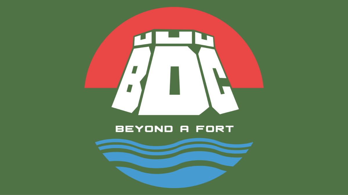
💻 Jixo: Typography for Digital Living
![]()
Jixo is everything Poothali isn’t—digital-first, crisp, fast, and designed for people navigating modern systems.
But even here, the typography wasn’t an afterthought. It was the foundation.
We chose:
*A geometric sans-serif that feels both structured and warm
*Sharp terminals and consistent x-height for on-screen legibility
*A slightly playful tilt to reflect creativity without losing clarity
Jixo’s branding needed to sit across multiple contexts: digital dashboards, product mockups, social media templates, and more. And the typography held up—clear, balanced, and endlessly adaptable.
The tagline, “Living Homes. Digital Life.”, rests just beneath the logo in a soft, neutral font. This contrast allows the brand to speak boldly, yet comfortably, to the modern homeowner and creative professional.
Jixo’s typography isn’t trying to charm you.
It’s built to guide, inform, and gently stand out—a digital tool with design empathy.
🧭 How Fonts Help Brands Breathe
Whether it’s a paddy-view homestay in Kasargod or a UI toolkit for modern homes, the font carries weight.
It shapes the mood of your WordPress website, the cadence of your digital marketing, and the tone of your social media captions.
Here’s what we look for when choosing fonts:
*Cultural resonance — Does it reflect the place and the people behind it?
*Tone match — Should it be soft, bold, modern, or timeless?
*Platform flexibility — Will it work across print, packaging, web, and social?
Typography isn’t something we decorate with.
It’s something we design from the heart outward.
Fonts That Feel Like Place
Some brands want to impress.
The ones we love working with—Poothali, Jixo, Janika, and others—want to belong.
And belonging often begins with a font.
A single letter that makes you feel: Yes, this is familiar. This is right. This is me.
At LaLaland, we choose fonts like we choose words in a letter.
Carefully. Emotionally. And with a deep respect for where your story comes from.