The Code Peers Identity Designed by LaLaLand Creatives
When Code Peers came to us, they already had a clear vision—minimal, creative, and sharp. They wanted something modern yet approachable. Their brand had to speak to design-savvy creators and digital-first businesses without ever feeling cold or corporate.
And so, together, we folded that idea—literally and visually—into the brand.
The Logo: Where a Folded Paper Meets a Digital Curve
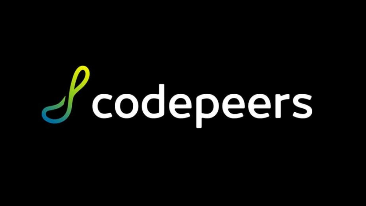
At first glance, the Code Peers logo feels fluid and effortless. But behind its elegant loop lies the core idea: a folded piece of paper. A nod to creativity in its simplest, most analog form—a medium every designer, artist, or thinker has once played with.
As we shaped the mark, we saw it naturally form the letters C and P—subtle, almost hidden, like a quiet creative wink to those who know.
The gradient color palette—flowing from green to lemon yellow—was a non-negotiable request from the client, who was particular about freshness and vibrancy. It had to reflect their ethos: colorful, progressive, and always evolving.
A Brand Book That Leaves No Color Untouched
Our next task was to document the identity with precision. The Code Peers brand book became more than just guidelines—it was a toolkit for creative consistency.
We defined:
- Logo lockups and spacing rules
- Primary and secondary color usage
- Typography that felt clean, modern, and quietly confident
- Imagery guidelines that allowed playfulness without clutter
The client wanted flexibility, but also clarity—so we made sure the system allowed both. Whether it’s a pitch deck or packaging, the brand always holds its shape.
Website Design: Creative, Fast, and Fresh
Code Peer’s audience is fast-moving and digitally fluent. So we built a WordPress website that’s light, responsive, and easy to update. Pages flow like the brand itself—clean but not boring, friendly but not childish.
Every hover, scroll, and transition was designed to mirror the fold and curve of the logo. The interface feels smooth, intentional, and expressive—just like the mark.

What We Imagined, Together
We imagined a young creative sitting on a chair, laptop in hand, with the brand form gently rising behind them—almost like a thought cloud, or a creative shield. One of our key visuals reflects that moment. It says: Here’s a brand that holds space for creators.
The logo isn’t just a mark. It’s a movement. A flow. A beginning of ideas.
Why This Project Matters to Us
At LaLaLand Creatives, we care deeply about making brands feel human and beautiful. With ColorPeter, we got to blend thought with play—form with freedom. And that’s our favorite place to be.
If you’re looking to create a brand that stands out without shouting, that holds your story in every curve and color—talk to us.
👉 We’re here for your branding, logo design, and WordPress website development needs.
Let’s fold ideas into something beautiful.
Reach out to LaLaLand Creatives.
Let’s imagine, shape, and build your brand—together.