A Ride Through Kerala, Not Just Across It
It didn’t start with a car.
It started with a feeling.
A man walked into LaLaLand one afternoon with an idea—not for just another premium cab service, but for something more personal, more rooted. He wasn’t looking to build an app-based fleet. He wanted to offer something Kerala would be proud of.
> “Imagine stepping out of the airport into humid, green-scented air… tired, maybe a little lost.
> And then, there’s a cab waiting. But it doesn’t feel like a transaction.
> It feels like a welcome.”
That’s when we knew:
This wasn’t about cabs. It was about belonging.
And that’s how GOC — God’s Own Cabs came to life.
The Name: Familiar, Friendly, and Full of Meaning
We wanted something simple. Something that could be whispered, remembered, printed on a cab door, and still carry weight.
GOC.
Short for God’s Own Country—a phrase every traveller to Kerala already knows and trusts.
But also reimagined as God’s Own Cabs—a subtle shift that changes everything.
From destination, to companion.
It’s not a company. It’s a friend you meet at arrivals.
The Design: Where Stillness Meets the Street
Our visual identity for GOC began with a question:
“What does Kerala feel like from the backseat of a cab?”
A stretch of green paddy fields through a half-rolled window
A coconut tree reflected on the windshield
The slow curve of a backwater road as rain taps the roof
We brought that into the brand’s palette:
Calm whites. Verdant greens. Muted golds. Space to breathe.
The logo is clean, modern, and rounded—no loud colors, no unnecessary swirls.
Just a smooth, solid wordmark that feels as reliable as the person behind the wheel.
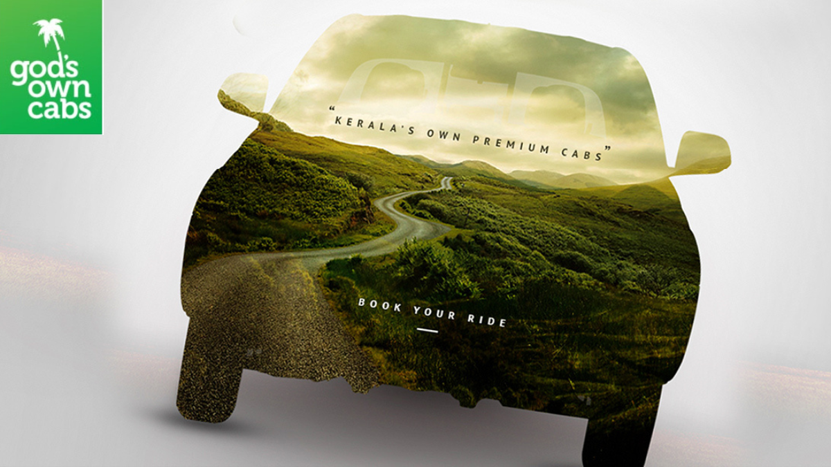
The Car that Carries Kerala
One of our favorite creative elements?
A car silhouette—cut open and filled with a living Kerala landscape.
Mountains, palms, morning fog.
It’s not just a visual. It’s a promise:
“Your ride is part of your journey—not a pause from it.”
Every car feels like it belongs to the place, not apart from it.
Every driver, a guide with stories.
Every route, a slow unfolding of Kerala’s poetry.
The Website: Built for Trust, Styled for Ease
For the UI/UX, we stripped away the clutter.
No five-tier menus. No hard sells. No shouting.
Just a homepage that greets you with:
“You’ve got a friend in God’s Own Country.”
Fleet categories are crisp and clear—Economy, Business, SUV, Travellers, Luxury.
The booking flow is as easy as a WhatsApp chat.
And every line of copy carries a human touch:
> “Looking for a quiet ride and a scenic view? We’ve got you.”
> “Need a bigger car for the cousins and the luggage? Done.”
It’s all written like a local speaking to a guest—relaxed, real, and warm.
What We Created
- A name that locals respect and travellers remember
- A visual identity rooted in Kerala’s natural beauty
- A logo and palette that feel premium but not posh
- A website experience that doesn’t overwhelm—it welcomes
- Copywriting that’s equal parts host, friend, and guide
Not Just a Brand. A Beautiful Beginning.
At LaLaLand, we don’t just brand businesses.
We craft experiences—wrapped in feeling, culture, and creativity.
GOC is a perfect example: a cab service, yes—but also a cultural companion through Kerala.
One that doesn’t just move you from place to place, but brings you closer to the soul of the state.
Want a Brand That Feels Like a Journey?
Whether you’re building a product, a service, or a movement—we’re ready to shape it with you.
Explore more stories at LaLaLand Creatives, or get in touch for:
- Branding & Visual Identity
- Logo Design
- WordPress Website Development
- Digital Marketing & Social Media Management
Let’s build something honest.
Something beautiful.
Something you’d trust to take you home.