In the heart of the Middle East, where the sun warms groves of ancient olive trees and every kitchen has a bottle of green-gold goodness, olive oil isn’t just a product—it’s a ritual. And on shelves overflowing with sameness—curved fonts, muted greens, and age-old clichés—Wild Olive wanted something different.
So they came to LaLaLand, not just for design, but for clarity.
“Make it clean. Make it stand out. Make it feel premium, without being loud.”
We listened—and responded with packaging that’s quietly striking and confidently simple.
A Label that Speaks Without Shouting
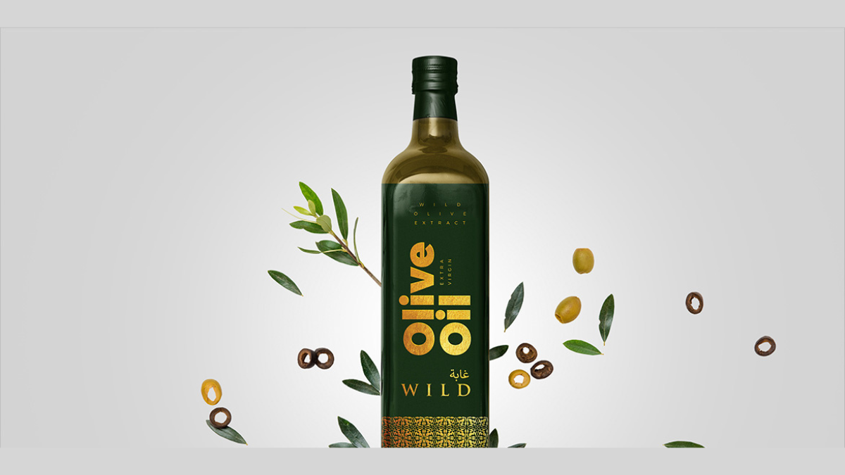
The bottle itself remains familiar. But what wraps around it is where the story changes.
We chose a two-color system that redefined the category:
- A deep, matte green—rooted, rich, and earthy, like the olive groves themselves
- A sharp, elegant gold—subtle enough not to sparkle, strong enough to signal quality
No clutter. No illustration overload. Just pure space, carefully considered typography, and a layout that breathes.
The label is bilingual, with English and Arabic text gracefully balanced—making it both accessible and respectful of its Middle Eastern market. Every line is aligned with intention. Every element earns its place.
The result? A bottle that draws the eye not by competing—but by calming.
It feels premium, organic, and beautifully restrained—like something you’d pick up instinctively, not because it shouts, but because it feels right.
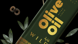
The Logo: Simplicity with a Hint of Wind
For the Wild Olive logo, we kept things gentle and abstract—letting the name guide the form.
The type is refined and open, almost breezy—subtly echoing the movement of wind through trees. No iconography. No fuss. Just a confident wordmark that lets the product shine while still anchoring the brand.
It was important that the logo worked well across bottles, cartons, and future brand extensions—so we designed it to be timeless and scalable.
More Than Packaging: The Foundation of Visual Identity
While our scope was limited to logo and packaging design, we approached the project as the beginning of a visual identity—a brand that could grow roots in the Middle East and extend into kitchens, concept stores, and curated gift boxes.
Because every detail matters. And for a market as visually saturated as this one, simplicity is a brave choice.
The LaLaLand Way
At LaLaLand, we believe brands don’t need to be loud to be seen. They just need to be honest, well-made, and beautifully told.
We’re a full-service branding agency that works across:
- Packaging design
- WordPress website development
- Digital marketing
- Social media management
- Brand strategy and visual identity systems
And while Wild Olive began with just a label and a logo, the story has only just begun.
Let’s Build Something You Can Be Proud To Put On a Shelf
If you’re crafting a product, rethinking your packaging, or looking to develop your full brand ecosystem—from visuals to voice—we’d love to be part of that journey.
Explore more brand stories at LaLaLand Creatives, or get in touch to talk about your next big idea.
Because when you design with heart and intention, even the simplest bottle can feel like an object worth keeping.