Designed to Stand Out
Walk into any Middle Eastern market and you’ll know—dry fruits and nuts aren’t just food. They’re culture. They’re gifts, rituals, celebrations, and everyday nourishment wrapped into one.
So when the founders of Roots approached LaLaLand Creatives, they didn’t ask for something flashy.
They asked for something honest.
> We want our packaging to feel simple, natural—but it has to stand out on the shelf. It needs to feel like us.
And that’s where our journey began—with a word.
Roots!
A name as rooted as the very trees their nuts come from.
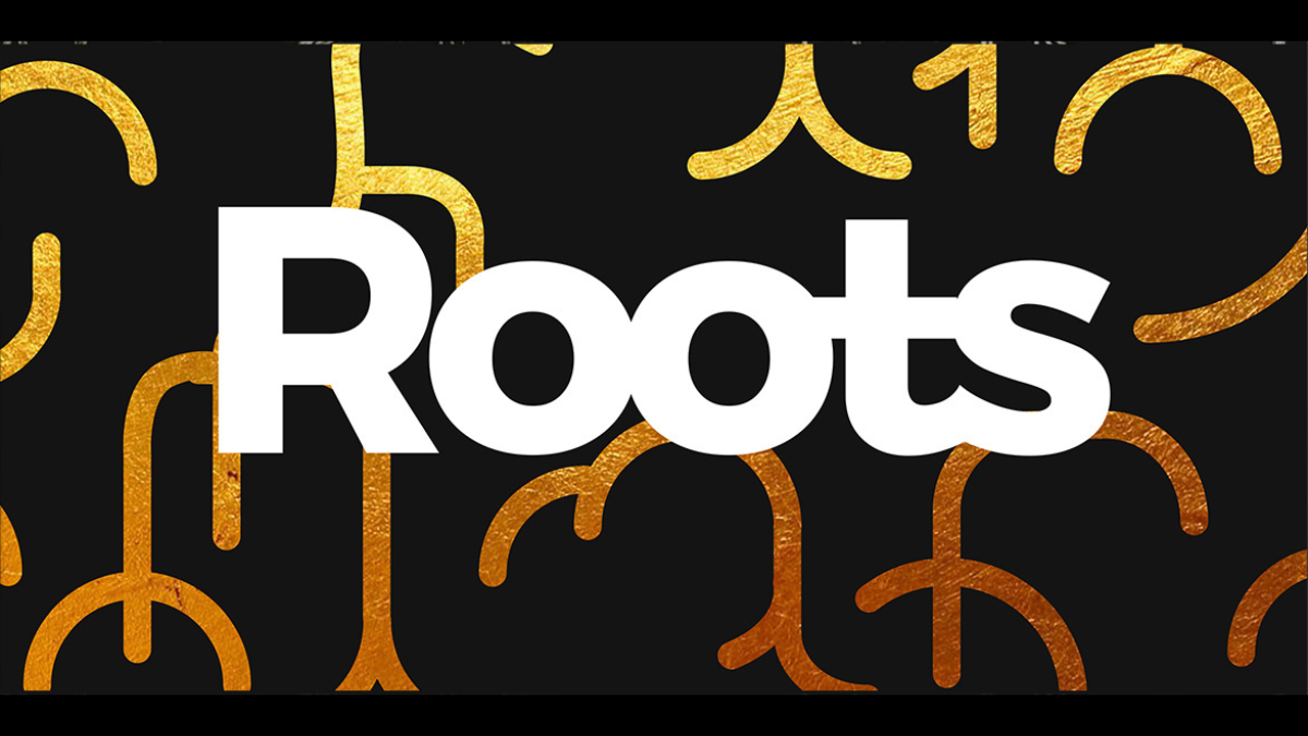
The Logo: Where Roots Speak Louder Than Words
We started with the word “Roots” and listened to what it whispered.
It spoke of origin.
Of grounding.
Of nourishment from below the surface — the quiet work that makes everything else flourish.
So we built the logo around that.
A mark that feels earthy, simple, and deeply connected.
The design draws inspiration from intertwining roots — those natural patterns we often overlook, but that hold the power of life itself.
🌰 Each curve and line carries softness and strength. It doesn’t shout. It belongs—just like a root belongs to soil.
The shape is minimal. Organic. The kind of form that feels timeless whether it’s printed in gold on a gift box or embossed on kraft paper.
Packaging That Doesn’t Try Too Hard—It Just Feels Right
The Middle Eastern retail shelf is full of shine. Glossy finishes, metallic inks, and bold fonts.
But Roots wanted to go the other way.
They wanted restraint.
Stillness.
And above all, a design that would make someone stop—not because it screams, but because it feels true.
We designed their packaging to reflect that:
* Natural tones that reflect the rawness of their ingredients
* Minimal typography that allows the product to breathe
* A layout that feels calm and confident amidst the noise
From gift pouches to shelf packs, every design choice was rooted in the same principle: Let the product and the name speak gently but clearly.
What Roots Really Mean
In brand language, roots aren’t just about agriculture.
They’re about identity.
The Roots logo doesn’t just nod to nature—it speaks of where you come from, what holds you up, what keeps you grounded in fast-moving markets and fleeting trends.
It’s a reminder: in a world full of surface-level stories, the real strength is below — in the roots.
The LaLaLand Way
At LaLaLand Creatives, we don’t chase trends.
We design with feeling, with cultural clarity, and with the quiet power of narrative.
With Roots, we delivered:
* A logo that feels natural and timeless
* Packaging design that reflects simplicity, strength, and Middle Eastern elegance
Want to Grow Your Brand from the Ground Up?
Whether you need a logo that speaks, packaging that pops, a custom WordPress website, or strategic digital marketing — we’re here for you.
Get in touch with LaLaLand Creatives.
Let’s build something rooted. Real. And ready to grow.