The Bold Brand Journey of BDC with LaLaLand
When Bekal Destination Company (BDC) approached us, the brief was clear—but full of depth.
They weren’t just another travel company. They were storytellers of place, rooted in Bekal, a coastal gem in Kasargod, North Kerala.
Their wish? A logo that felt as solid as Bekal Fort, and as fluid as the Arabian Sea brushing against its ancient walls.
And we knew right away—this wasn’t just about creating a logo. This was about crafting a place-based identity. A brand that could stand tall like a bastion, yet move freely like a wave.
Where the Journey Began
Our first design direction was inspired by two things:
🔴 The red laterite fort walls of Bekal — weathered by history, still standing strong.
🔵 The blue sea — always moving, always alive.
We imagined a brand that would live in both these elements.
BDC was born to be a bridge: between history and hospitality, between travellers and traditions, between land and sea.
The Logo: Strength and Flow, Encoded
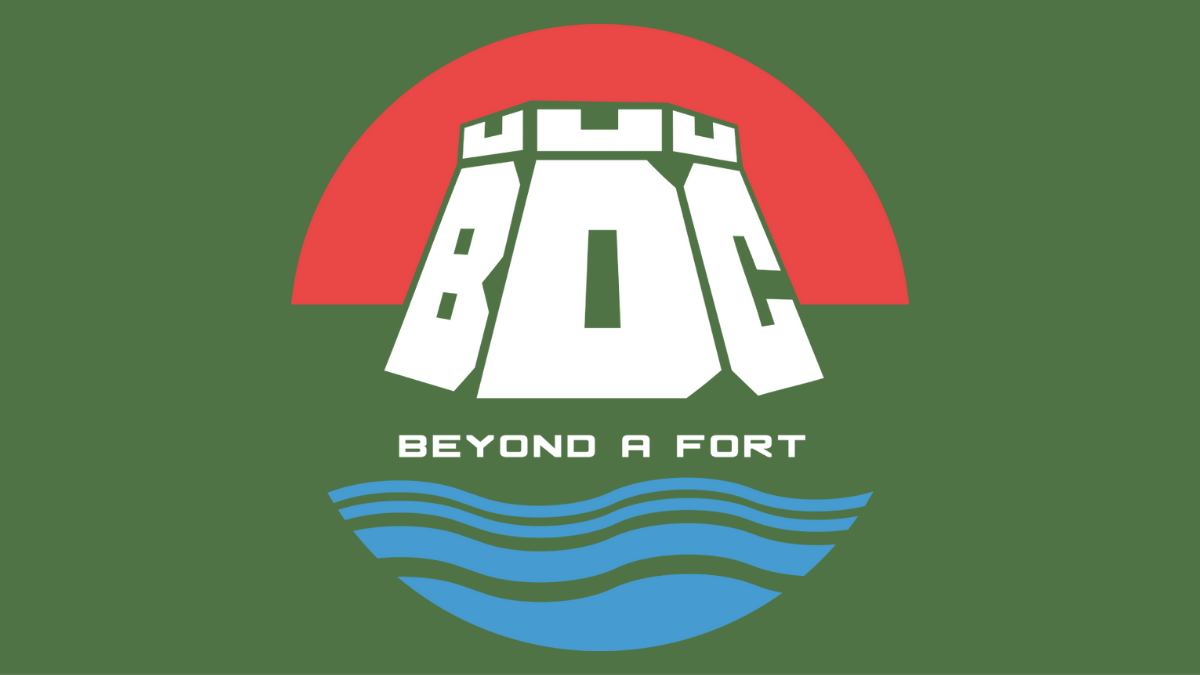
At first glance, the BDC logo is bold and architectural.
But look closer—and it begins to unfold.
🏰 The letters themselves form the shape of a fort — thick, grounded, unshakable. The tops of the letters mirror fort battlements, instantly evoking Bekal’s signature silhouette.
🌅 The semi-circle of red above? That’s not just a design element. It’s the Bekal sunset, casting its glow over the fort—a familiar, comforting sight for anyone who’s stood at its edge.
🌊 The waves at the bottom, in clean, flowing blue lines, speak of the sea below—the constant rhythm of tides, travelers, and tales.
Together, it creates a logo that feels like Bekal itself: solid, scenic, and full of story.
Branding That Tells a Story
Once the logo was set, we moved into full brand development.
The brand guidelines we delivered included:
- Typography: Strong yet simple, mirroring the fort’s timeless presence
- Color Palette: Red for the fort, blue for the waters, black for contrast, and white for clarity
- Design System: One that could stretch from signage to social media, yet feel consistently local
BDC didn’t want flash. They wanted credibility, clarity, and cultural grounding—and we made sure the brand delivered all three.
The Website: Built on WordPress, Designed to Travel
For a brand in tourism, the website had to feel like an invitation. So we built them a custom WordPress website, designed with:
- Mobile-first layout
- Easy navigation
- Visuals that reflect Bekal’s beauty — not as a postcard, but as a place you feel
The interface is seamless, the tone is welcoming, and every page reinforces the brand’s promise:
“You’re not just visiting a fort. You’re going beyond it.”
Digital Marketing: Running Campaigns that Convert
Today, LaLaLand Creatives proudly manages BDC’s digital marketing—and the results are speaking for themselves.
We run targeted campaigns highlighting:
- Unique stays and local experiences
- Offbeat trails beyond Bekal Fort
- Visual stories that connect travelers to culture
The LaLaLand Creatives Touch
At LaLaLand Creatives, we believe in building brands that are rooted, real, and ready to grow. Whether it’s logo design, branding, WordPress website development, or digital marketing, we bring local insight and global design intelligence to everything we create.
Want to Build a Brand That Feels Like a Place?
Let’s talk. Whether you’re starting up or starting over, we’d love to shape your story.
Get in touch with LaLaLand Creatives — where your brand becomes more than a name. It becomes a feeling.